Analytical Paragraph English

What is Analytical paragraph?
A type of descriptive writing which is written on the basis of given chart, graph, data, clues, etc. is called analytical paragraph.

What is analytical paragraph writing?
This form of writing requires analysis and comparison of the given facts and figures and drawing conclusion based on the given data. It is used to derive information from a collected set of data. This data can be in the form of bar graph, table, line graph or pie chart, etc. The data can also be given in the form of clues or data outlines. This form of writing is used to interpret the facts presented in the given source. A graph or chart is a visual stimulus to depict the data. The purpose of analysis is basically to examine the whole part as a basis for clarification, interpretation and discussion. The student is required to provide an analysis and comparison of the given facts and draw conclusions based on the given data. Compile the given set of data and frame it into a paragraph. However, remember not to include any additional information which has not been mentioned in the given graph or clue.

Formation of Analytical Paragraph:

  • Beginning: Always begin your writing by giving an introduction of the given information. Describe the topic of analytical paragraph writing in 2-3 lines.
  • Body of the Analytical paragraph: In the body of the analytical paragraph, divide the given information in two paragraphs. State the facts given in the graph or chart. Draw comparisons if required and write the information using a crisp language. Never deviate from the topic and don’t add any information not provided in the chart or graph.
  • Conclusion: This is the concluding part of Analytical paragraph writing, sum up the information in last paragraph in a very precise form.

Points to remember:

  • Understand the objective of the given graph or chart
  • Use given evidence to make your point
  • Write the introduction, body paragraphs and conclusion
  • Don’t include facts that can’t be supported with a reference
  • Focus on the quality and not the quantity
  • Keep it clear, concise and unambiguous

Analytical Paragraph (Solved)

Analytical Paragraph 01

“Tourism in India means growth of India.”
Write a paragraph to analyse the given argument in about 100-120 words. You could think about what alternative explanations might weaken the given conclusion and include rationale / evidence that would strengthen / counter the given argument.

The development of tourism industry will definitely lead to development of the country as a whole. India is a land of beautiful landscapes, rivers and places of religious, historical and cultural importance. We have innumerable tourist destinations which if used to their full potential can bring about a lot of development in the country.

Tourism being one of the biggest and fastest-growing industries globally, affects the economic, socio- cultural, environmental and educational resources of nations. Improving tourism industry in India would thus contribute to the development of the nation in many spheres. It will have many positive effects on our economy. It will help in the growth and development of various industries directly linked with the tourism industry such as those pertaining to transportation, accommodation, wildlife, arts and entertainment. It also helps in the creation of new jobs. A lot of revenue will also be generated through foreign exchange on payments received for goods and services provided. The development of tourism also enhances the living conditions of the local people.

Analytical Paragraph 02

The given information shows how some housewives spend their spare time. Read the given information and write an analytical paragraph in 100-120 words describing about the given information :

  • 10% in knitting
  • 15% in reading
  • 50% in watching television
  • 20% in exercising
  • 5% in meditating

The given information states about the different types of activities housewives did in their spare time. The activities are knitting, reading, watching tv, exercising and meditating.

The most preferred choice among the housewives to spend their spare time is to watch tv. Almost 50% females preferred it and made it the most favourite pastime. Next preferred choice is exercising which was preferred by 20% of housewives. Reading and knitting were neck to neck in preference and stood at 15% and 10%. 15% housewives chose reading to do in their spare time whereas only 10% preferred to do knitting.

The given data shows that the modes of entertainment i.e., watching tv and reading were preferred by most housewives to utilise their spare time. Healthcare was also a choice made by 20% housewives who preferred exercising in their spare time, but mental healthcare was at the back foot as only 5% housewives preferred to do it in their spare time.

To conclude the given data we can say that different women have different choices and it is also guided by the circumstances they have around them. As watching tv can be mingled with many other activities and many tasks can be done simultaneously while watching tv, it stood as the most preferred choice whereas meditation which needs utmost concentration and no disturbance was the least preferred choice.

Analytical Paragraph 03

“Mental health and mental health issues are as important to be taken care of as other diseases. People often look down upon the people who share their mental health issues which is why it has become a taboo.” The given excerpt is taken from a health and wellness magazine.
Write a paragraph to analyse the given statement. Think of alternative explanation to counter or weaken the given statement. (100-120 words)

Our mental health encompasses our psychological, emotional and social well-being. This means it impacts how we feel, think and behave each day. Our mental health also contributes to our decision making process, how we cope with stress and how we relate to others in our lives.

There is a great misconception for the mentally ill. Many think these people are lazy or just making it up. There is also a mental block in people’s minds that these people are either crazy, possessed by demons, violent, out of control and unsafe. These are negative labels that have been attached due to the lack of awareness. Raising awareness can reduce misconceptions. Emotional and mental health is important because it’s a vital part of your life and impacts your thoughts, behaviors and emotions.

Being healthy emotionally can promote productivity and effectiveness in activities like work, school or care- giving. It plays an important part in the health of your relationships and allows you to adapt to changes in your life and cope with adversity.

Often mental health is disregarded as mood swings and many people consider having mental/psychological troubles as a sign of weakness. Reaching out and opening up to other people in your life can help provide emotional support. Depression is real and has many physical and psychological manifestations. Thus the topic mental health should be normalised and taking medical and appropriate help shouldn’t be frowned upon.

Analytical Paragraph 04

“Marital art is for self defense and discipline.”
Write an analytical paragraph supporting or tearing down the statement with proper reasoning and facts. (100-120 words)

Martial Arts is a great form of exercise as it has a number of health benefits. From physical fitness to mental and physical enhancement, martial arts paves way for people to reach their peak potential. There are different types of martial arts and children should learn at least one type for well rounded physical growth and personality.

Martial arts will help to teach children the art of self- discipline. It teaches restraint and patience. Learning martial art is a full body workout not only for the body but the mind as well. Having a competition or tournament that the children can aim for helps them to set goals in life and whether they win or not it helps them to deal with either outcome which will be beneficial in later life.

It is also a good way to teach self defense without the aggression. If improves the reflex and can help in a number of day-to-day activities, such as driving and cooking. For children it keeps the mind sharp and in good shape to learn new skills.

Martial arts can help you relieve your daily stress and help you focus on your task at hand, providing you with the opportunity to get rid of distractions. A common misconception of martial arts is that they promote violent behaviour but in fact it is quite the opposite. Martial arts teach children peaceful, non-violent conflict resolution skills and emphasise that physical altercations must be avoided.

Analytical Paragraph 05

“The land of Goddesses is not safe for its own female citizens.” This excerpt is taken from a newspaper article.
Write a short analytical paragraph on the safety of women in India in about 100-200 words to analyse the given argument. You could think about what alternative explanations that might weaken the given conclusion and include rationale/evidence that would strengthen / counter the given argument.

India is known to be one of the most unsafe places for a woman to live in. The statistics alone is staggering. Crime against women especially sexual violence is quite high and frequent.

Concerns about safety restrict the mobility and activity of women and leave them with no choice but to strategise everything from timings to travel, how to walk, how to dress or commute. When we talk about women’s safety, the biggest question is how do we keep our mothers, sisters and daughters safe against violence outside the house. Women are often stared at, molested and discriminated against. Not only outside the house, they are even discriminated against at the workplace and in their homes. It is surely the responsibility of the government and each one of us strive for a safer world for women.

Effective implementation of strict laws protecting women’s rights is the need of the hour. Offenders must be socially boycotted and severely punished to deter future crimes against women. Another imperative step is teaching self-defense techniques to women and girls at schools, colleges, offices and residential colonies. As long as the mindset of people will not change, women can never be safe. All we need to do is to be alert and considerate. We have to develop basic morality and nurture a value system that teaches respect for women. Women are not safe anywhere in the globe until the thinking towards women changes. So the actual need of the hour is a revolutionary change in the mindsets and conscience of men so that they view women with regard and respect.

Analytical Paragraph 06

“Joint Family or Nuclear Family there is no guarantee of a happy family.”
Write an analytical paragraph exploring the idea of a nuclear family and if it should be the ideal choice. You could think about what alternative explanation might weaker or strengthen the given statement. Include rationale and evidences. (100-120 words)

The nuclear family or smaller family is usually preferred and recommended in today’s modern lifestyle as it gives more freedom, financial stability and independence when compared to the joint family structure.

While less conflict and decreased family stress is an advantage of the nuclear family, it also puts the family at a disadvantage. Conflict is a part of life, and conflict resolution skills are beneficial in school, community and the workplace. Nuclear families can develop like- minded thinking, leading to fewer arguments within the family unit.

While joint family is like a nursery to teach social virtues. It helps to develop social virtues like co-operation, sympathy, sacrifice, affection, spirit of selfless service, obedience and broad-mindedness. Feeling of loneliness is one of important drawbacks in nuclear family. At the time of emergency one can get any help and support from other members. Joint family acts as insurance for the members of the family at the time of crisis. It provides social security to its members especially to the old, the infirm, the unemployed persons, the orphans, the widowed daughters and sisters as well.

The choice to raise a family by the nuclear model does not guarantee success or happiness but can provide a basis for obtaining those ideals. Awareness of the possible advantages and disadvantages allows a big-picture view of this family structure. No family is perfect, but when you work together with family members, you ensure the best possible outcomes for everyone involved.

Analytical Paragraph 07

Write an analytical paragraph in 100-120 words on the importance of school library in school and how it helps in the development of young minds.

There is no doubt libraries in schools make a difference to students’ understanding and achievement. They provide support for teaching and learning for both students and teachers. The school library makes sure that each student has equal access to academic resources, books, expensive reading material irrespective of their home opportunities or economic status. Not just students it provides teachers with full access to relevant curriculum, books, reference material, etc.

The library is a model for inquiry learning and building knowledge and confidence and seeking and processing information. It is a fundamental resource for supporting students’ learning and reflects and encourages collaborative learning and sharing of ideas. Another potential quality of the school library is its potential for comprehensiveness. Moreover a school library is the best place to learn how libraries function in general and how one should make effective use of libraries. Students who are regular to their library develop questioning skills and become creative and critical thinkers. It is in the library where students become active seekers and users of information. They learn to discriminate and use valid information that is relevant to their task. The school library thus aims to give every student the opportunity to learn, to enjoy reading and to enhance their knowledge and understanding.

Analytical Paragraph 08

“The latest trend of online classes is a bane as well as a boon.” The given excerpt is taken from an article.
Write an analytical paragraph in 100-120 words highlighting the pros and cons of online classes. Provide rationale/ evidences to counter or strengthen the given statement.

In traditional classrooms, teachers can give students immediate face-to-face feedback. Students who are experiencing problems in the curriculum can resolve them quickly and directly either during the lecture or during the dedicated school hours. Personalized feedback has a positive impact on students, as it makes learning processes easier, richer, and more significant, all the while raising the motivation levels of the students.

Due to the lack of face-to-face communication between peers, students and teachers in an online setting, the students might find that they are unable to work effectively in a team setting. Neglecting the communicational skills of the students will inevitably lead to many graduates who excel in theoretical knowledge, but who fail to pass their knowledge on to others.

The E-Learning methods currently practised in education field tend to make participating students undergo contemplation, remoteness and a lack of interaction.

In schools and colleges, students have a proper environment for study. They are committed to learning with discipline and ready to explore creativity. To explore creativity and discipline we need to provide an environment for students to learn. When taking online classes at home there are fewer chances to create an environment for study. It required support from other family members. That’s not possible in joint families. This is a big disadvantage to study at home. Even getting the notification and mobile calls also disturb students to focus on study. Offline class in front of the teacher is highly focused on the topic and no one can disturb the classroom.

Analytical Paragraph 09

“You are what you eat. Be wise.” The given statement is taken from an article. Write an analytical paragraph in 100-120 words to analyse the given statement. You could think about what alternative explanations might weaken the given statement and include rationale / evidence that would strengthen or counter it.

Eating a healthy diet and following a healthy lifestyle can keep a person happy and fit. Maintaining a healthy diet is about making right food choices about what to eat with the intention of attaining good health. Healthy food means nutritious food which are considered good for the well being of an individual. According to a recent survey school students are the worst victims of malnutrition which has adversely affected their academic performance. A major cause of this condition attributes to the junk food intake.

In today’s hectic lifestyle where both the parents are working and the family set up is nuclear, the kids are often rewarded with junk food or in some cases literally survive on junk food. These food habits eventually effect the health of children and they suffer from life threatening diseases at the very early stage of their life. Obesity is one of the major drawbacks of junk food where the child is fat but physically very weak and fatigued.

We should inculcate good food habits in children from the very young age. We should encourage them to eat fresh fruits, green vegetables, fresh juices, coconut water, etc. Schools should neither allow junk food in school canteens nor the children to bring it from home. Healthy food keeps us away from various diseases. By eating fresh food, we feel light, relaxed and energetic. Healthy food helps a person in enhancing physical and mental well being. There are several benefits of eating healthy food:

  • Healthy food promotes overall health. They provide us a strong and healthy body. Healthy food habits save us from obesity.
  • Healthy food is full of different nutrients which provide us energy and also keep our brain healthy. Healthy food improves and strengthens our immune system and digesting.
  • Healthy food keeps a lot of diseases at bay.

We should follow healthy food habits to attain a healthy life. A healthy mind resides in a healthy body, therefore is necessary to eat healthy food to possess healthy body as well as healthy mind.

Analytical Paragraph 10

“The glitz and glam of city life attracts a lot of people residing in rural areas every year.” The given argument is taken from a newspaper article. Write an analytical paragraph in 100-120 words analysing the statement. Provide argument to counter it or strengthen it by giving evidences.

Big cities always attract people and with the advent of globalisation and even before it, basic amenities, such as good opportunities of employment, education, medical facilities, water, etc. are all concentrated to cities only. People from small towns and villages come to big cities in hope of a better future. But these people come to big cities with no background or even place to live. This gives a rise to a mushroom growth of slums in cities. These slums have become an integral part of every major city and people live here in quite inhuman conditions. If such migration continue, then in a few years, the cities would be heavily populated which could result in lack of basic facilities in cities too.

The villages in India are majorly agriculture based on which practically the whole country depends but villages are the places and villagers are the people who suffer the most. There is still no proper electricity, water, schools or hospitals available in villages. Erratic weather conditions also make villagers suffer lot. Even after trying, Indian Government has not been able to better the condition of villages and give the villagers their due.

These are the factors which make the people of villages and small towns move to big cities in hope of a bright future. They migrate to cities and live in slums which is also causing pressure on civic amenities. There is an urgent need to deal with this problem. The government must either discourage migration of people from rural areas by providing them enough facilities to live comfortably in their villages or make these slums regularised colonies. The best way to stop the rapid migration of rural people and growth of slums is by creating better job opportunities in rural areas. Also, providing better education and medical facilities is necessary.

Once, the rural people feel that they have all that they need, they won’t feel the need to shift base to the big cities.

Analytical Paragraph 11

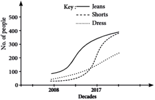
The given line graph shows the trend of western wear among the youth in two decades. Summarise the given information in 100-120 words.Analytical-Eng-10-11

The given line graph shows the data of trends in western wear among the youth in last two decades. The preferred clothing is jeans, shorts and dress and the total number of people is in hundreds.

The given data starts in 2008 and shows very less number of people being interested in western wear. The number stands at less than 100 where the most preferred is jeans and least preferred is shorts. Jeans sees a good increase in the number of people as it shows a hike and reaches more than 300 and higher towards the next decade. Throughout the first decade shorts remained least preferred and dwells at less than even 50 and gradually showed an increase towards the beginning of next decade. The data of shorts is very dramatic and shows a sudden hike or growing interest in people. Dress is the second preferred choice and it also shows a growth in number towards the next decade. In the first decade it remained at less than hundred but in the end touched 100.

The most preferred choice is jeans which although started with a little less than 100 people interested in it, showed a stable growth of interest in the first decade itself. It reached its highest most in the next decade which also shows a sudden increase in shorts in next decade almost levelling off with jeans.

To conclude the given data, we can say that after the two decades both jeans and shorts are the most preferred choices and even dress seemed to show great momentum and seems to be levelling off with the first two most preferred choices.

Analytical Paragraph 12

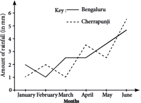
The given line graph shows the average monthly rainfall in the given two cities i.e., Bengaluru and Cherrapuji.
Write an analytical paragraph in 100-120 using the information given in the chart.Analytical-Eng-10-12

The given double line graph illustrates the average monthly rainfall in six months from January to June of two cities Bengaluru and Cherrapunji, and the data compares how the rainfall in these two cities changes over a period of six months. The rain-fall is measured in millimetres.

As the graph illustrates the rainfall is roughly 2 and below 2 millimetres in Bengaluru in the months of January and February respectively. It is 2.5 mm in March and remained same in April also. In the month of May there is a slight change and the rainfall is heavier than other months levelling off 3.5 millimetres. The graph shows heaviest rainfall in June, which is 4.5 mm, the most rainy month of all the given six months.

On the other hand the rainfall in Cherrapunji remained 2 mm and below till March and then it started rising and reached 3.5 mm in April. Then it fell down again in May nearly reaching 2.5 mm. Then the rainfall turned heavy and reached 5,5 mm in June which shows that heaviest rainfall of the city.

Overall the data demonstrates that the average rainfall of the cities from January to March is around 2 millimetres. Rainfall remained same in April also in Bengaluru whereas it is heavier in Cherrapunji in the same month. But it lowers in May in Cherrapunji.

However, rainfall is slightly heavy in both the cities in June in comparison to other months. But still Cherrapunji has shown comparatively heavier rainfall than Bengaluru. Thus, June is the most rainy of all the six months in both the cities.

Analytical Paragraph 13

The given pie-chart represents the discipline-wise breakup of candidates appeared in an interview. Study the given pie chart and write an analytical paragraph in 100-120 words.
Total numbers of candidates appeared in the interview = 22500.Analytical-Eng-10-13

The given pie chart shows the discipline-wise average percentage of the candidates appeared in an interview.

The given data shows that among 22,500 applicants, the highest percentage of candidates applied for the job is in accounts. The second most applied discipline is marketing, then comes the medical field which has 15% of the total candidates and the arts and HR section has almost the same number of candidates. The others section has only 16% of candidates which shows that very less number of candidates are interested to get job in others section.

The pie chart shows a vast difference between the number of candidates applied for accounts and the other disciplines. It clearly shows that most of the candidates which sums up a total of 23% are interested and willing to get job in accounts section.

Marketing is also preferable over other disciplines mentioned in the chart.

To conclude the given chart, it clearly shows that accounts is the most preferred choice. This has helped us in understanding the candidates’ choice and preference to get job at the most designated sections which might fetch them a lucrative salary package.

Analytical Paragraph 14

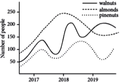
The given graph shows the increment in consumption of nuts over a period of three years. Write an analytical paragraph based on the given information in 100-120 words.Analytical-Eng-10-14

The given line graph shows the consumption of three types of nuts i.e. walnuts, almonds and pinenuts over a period of three years 2017 to 2019. The data shows the number of people in hundreds.

In the beginning of 2017 all the nuts were under 100 but almonds were the most preferred one at slightly below 100 and pinenuts were the least favourite at even less than 50.

The year 2018 shows great hikes in interested people in all three nuts with almonds reaching its highest of all three years, going a little more than 200. Walnuts began at around 50 in 2018 but reached its highest of 200 by the end of 2018. Almonds showed a gradual growth from 2017 and towards 2018 end. Pinenuts also seem to be showing increase in interest and goes a little higher than 100 by the end of 2018.

2018 stands as the best year for the consumption.or sales of all three nuts but as 2019 approached it faced a decline in sales of all three nuts. Almonds had a sudden fall and reached 150 and remained static at it throughout the year. Walnuts although started on a low note, showed a hike and touched 200 but came down a bit towards the year end of 2019.

Year 2019 proved to be the best for pinenuts consumption as it reached its highest of 100 in this year.

To conclude the given data we can say that 2018 was the best year for all three nuts in terms of consumption but there was a sudden slump in the year 2019 and 2019 also faced static interest levels.

Analytical Paragraph 15

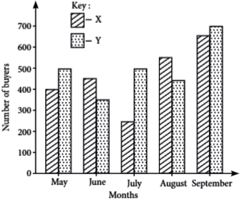
The given double bar graph shows the number of buyers of two different newspapers in a city during a period of five months. Write an analytical paragraph in 100-120 words elaborating the given information.Analytical-Eng-10-15

The double bar graph shows the data of number of buyers of two different newspapers X and Y in a city over a period of five months.

The data shows that the most popular newspaper among the buyers is Y-newspaper. The X-newspaper was bought by 400 people in May, 450 in June, 250 in July, 550 in August and 650 in September. If we observe we will find out that it has started with a good number of 400 people which consistently increased except for the month of June and then reached its highest number of buyers in September.

On the contrary, the most popular Y-newspaper started with 500 buyers in May, came down to 350 in June and then again jumped to 500 in July, 450 in August and highest 700 in September. It shows that Y newspaper is the most bought and preferred newspaper which started with 500 buyers in May and then saw a rise of 700 buyers in September.

It is clearly evident that there was not any great difference between the buyers of two newspapers but Y-newspaper had made a good progress fetching more buyers in the given five months.

Analytical Paragraph 16

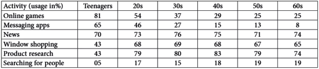
The following table shows details about the internet activities for five categories for different age groups. Write an analytical paragraph for the table given in 100-200 words.Analytical-Eng-10-16

The given table illustrates the internet activities of six age groups ranging from 15 years to those in their sixties for six different kinds of activities.

The table shows that those in their teens spend more time on online games and news, while the older generation spends time on the internet browsing for products and to do window shopping. It is clearly evident from the table that teens mainly use the internet for online games (as high as 81%) 70% of them use it for news and 65% use it for messaging and the least they use it to search for people which consists of only 5%. Those who belong to middle age group, i.e., people in 20s to 50s are highly interested in getting news, doing product research and window shopping, the percentage ranging from 70-80%. The internet activity which is least used by people is to searching for people on internet.

All the age groups spend only 50% to 20% of their time on the same. The amount of time spent to use messaging apps to text others decreases with age and gets as low as 10% for those in their 60s.

In a nutshell, the above table suggests that teenagers are most interested to spend time on playing games and sending messages to their friends and relatives. On the other side, older people are interested in researching and doing window shopping.

Overall, people are likely to spend the least amount of time searching for other people on internet.

Analytical Paragraph 17

The line graph below shows changes in the birth and death rates in New Jersey since 1905 and forecast uptil 2045.
Analytical-Eng-10-17Analyse the graph and write your observation in a paragraph of 100-120 words.

The line graph shows changes in the birth and death rates in New Jersey since 1905 and forecast uptil 2045.

Between 1905 and the present day, the birth rate has been consistently higher than the death rate. It stood at 20,000 at the start of this period and increased to a high of 70,000. Since then the rate has varied between 63 to 50 thousand and it is expected to decline slowly to 40,000 births towards 2045.

On the contrary, the death rate started at 10,000 and increased steadily until the present time. This increase was higher between 1985 and 2025 around 66,000 before dropping slightly in 2045.

To conclude, these opposing trends mean that the death rate might overtake the birth rate around 2024 and the huge difference between the two levels may reverse after that.

Analytical Paragraph 18

The given pie chart represents the amount of money spent by a family on different items in a month.Analytical-Eng-10-18 Write an analytical paragraph in 100-120 words using the information given in the chart.

The pie chart provides information about the amount of money a family has spent on different items in a month. On an average, the family has spent majorly on grocery which is twenty-three percent of the total expenses. Whereas it has spent 20 percent on education which shows that it’s the second priority for the family.

The other item on which it has spend the most is clothes and transportation which levels off 19 and 18 percent respectively. Fifteen per-cent of their expenses were on other items that might include stationery, cosmetics, accessories, etc. and the least they had spent was on their rent. The maximum amount was spent on grocery, education, transportation and clothes. Overall the data shows that they have not spent much on the unnecessary items or miscellaneous. After spending on grocery which is of utmost importance they have spent a significant amount on education. The least money is spent on miscellaneous items after spending on their rent which is their liability. Thus, it is evident that 85% of their total amount of money was spent on their liabilities whereas only 15 percent was spent on other items that might not be necessary to spend on.

Analytical Paragraph 19

The given bar graph shows the number of gamers on two digital platforms over a period of five years.Analytical-Eng-10-19 Write an analytical paragraph in 100-120 words describing the given information.

The given bar graph shows the number of gamers on two digital platforms over a period of five years. The digital platforms are Shiro gaming and MI gaming. The maximum number of gamers is 500.

By looking at the data, the growth of Shiro gaming looks a bit static from 2015 to 2018. In years 2015, 2017 and 2018 the number of gamers gained by Shiro gaming is same which is 300. It shows a dip of 100 gamers in 2016 which took the number of gamers down to 200. For the next two years i.e. 2017 and 2018 the gamers for Shiro stood at 300. The year 2019 is the best in performance for Shiro as it shows around 450 gamers being interested in Shiro gaming.

MI gaming started on a good note in year 2015 and has gained around 400 gamers. The next two years i.e., 2016 and 2017 again shows a dip in the number of gamers. 2016 stands as a bad year for both the platforms because this year the number of gamers was the least. The year 2018 showed a hike in the number of gamers and reached 400 gamers which was equal to their 2015 data. But it couldn’t hold the growth and came down to 300 gamers in the year 2019.

To conclude the given information we can say that overall both the platforms had almost same number of gamers though they had yearly variation in numbers. In 2017, both the platforms had same number of gamers but for ending note the last year i.e., 2019 showed better results for Shiro gaming.

Analytical Paragraph 20

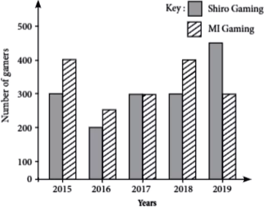
The pie chart shows the level of engagement or popularity of different social media platforms amongst the youth namely the college students in India during the year 2019.Analytical-Eng-10-20 Write an analytical paragraph in 100 – 120 words describing the information.

The given pie chart illustrates the frequency of usage or popularity of different platforms of social media amongst college students of India in 2019. We can clearly see the preference of the young people from this pie chart.

It is clearly evident from the pie chart that instagram is the most favourite amongst the young people with a whopping 34% using it. Closely followed by tiktok with 26%. The one social media platform with the least engagement from the young population of the country is Twitter with only about 8% using it regularly. Facebook and Quora have fairly the same amount of engagements taking up a decent 18% and 14% respectively. Facebook beating quora by a mere 4% but given the fact that Quora is a new platform against the old and standard Facebook says a lot for its rising popularity.

Instagram and tiktok coming out as the most popular app gives us this impression that the young people of India prefer the visually driven apps with little or no room for writing think-pieces. The pie chart establishes that the youth is not keen on socially and politically engaging platforms like Twitter.

Analytical Paragraph 21

Line graph below shows the comparison of rainfall in two different states of India that is Tamil Nadu and Shillong between the month of May- September. Analytical-Eng-10-21Write an analytical paragraph studying the graph in 100-120 words.

The linear graph illustrates the average monthly rainfall the two states of India gets during the rainy season. The data compares how the onset of monsoon, the rainy season also differs in time. The rainfall rate is measured in milimetres.

For Tamil Nadu the highest rainfall falls somewhere between the month of May-September. This means monsoon in South India begins early and stays for few months. If we look at the graph of Shillong the rainfall seems to be generally higher as compared to that of Tamil Nadu but its wettest month falls somewhere in the month of June-July. The descend in rainfall after the monsoon is not so drastic for Shillong as compared to that of Tamil Nadu. Tamil Nadu gets around 100- 200mm before and after its peak rainfall season.

Overall we can also tell Shillong receives a lot more rainfall as compared to Tamil Nadu. When their wettest months pitted against each other Shillong still comes out far ahead. Shillong during the monsoon receiving as much as 650mm of rain while Tamil Nadu peaks at 400mm only. For Tamil Nadu after August there’s very little rain barely around 100 mm while for Shillong it continues to receive an average of 300-400mm rainfall throughout the season.

To conclude, monsoons arrive earlier in Tamil Nadu about a month or so and then remain fairly dry for the most part of the year. While in Shillong monsoons start late but stay longer than Tamil Nadu and always receiving wet spells evenly spread throughout the year round.

Analytical Paragraph 22

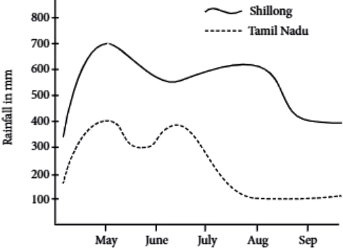
The given line graph shows the number of athletes participated in different types of games. Analytical-Eng-10-22Study the graph carefully write an analytical paragraph about it in 100-120 words.

The given line graph shows the number of athletes who participated in different types of games. The number of participants is in hundreds and their participation in five different games.

The athletes who participated the least is in 400 m race, where only 1500 people chose it. Next preferred game is long jump where the number of participants went slightly higher taking the count to 2000.

The participants of javelin throw comes next levelling off with 2500 participants. Two most preferred games are discuss throw and shot put. Discuss throw shows a hike of 1000 participants and levelling off at 3000 athletes playing it. Shot put is the most preferred game with most number of participants which is 4000. The given data which showcased the interest of athletes in different games, shows us that the most preferred game is shot put and the least preferred is 400 m race. Rest of the three games have an average difference of 500 participants.

To conclude, the given graph has helped us in understanding the games preference of around 4000 athletes in five different games.

Analytical Paragraph 23

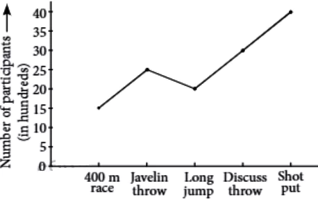
The given bar graph shows the interest of young people in pursuing different hobbies by girls and boys in USA. Analytical-Eng-10-23 Write an analytical paragraph in 100-120 words using the given information.

The given bar graph shows the number of boys and girls who pursue different hobbies in USA.

As shown in the graph, gardening is the most favorite pastime among girls and the least favourite among boys which levels off over 65 and less than 30 respectively. For all other amusements i.e., singing, painting and cycling are very popular among both the genders. As per the given chart the number of boys preferring cycling and girls doing gardening is almost equal. Most boys like to do cycling with around 65 compared to 55 girls.

Girls also like to do painting which levels off around 60, on the contrary only 40 boys like to do painting in their leisure time. There is a difference of about 20 between boys and girls showing interest in reading books. Around 50 girls like to read books in their free time whereas, only 30 boys in comparison to girls showed their interest in it. On the other hand boys other than cycling are more interested in singing, where almost 55 boys are there numbering 10 more than girls.

Overall, the figures demonstrate that girls significantly love to spend most of their leisure time in gardening and painting, and after that in cycling and reading books, and the least they want to spend on is singing. However, boys preferred cycling the most then singing and painting but significantly the least they preferred to do is gardening.

Analytical Paragraph 24

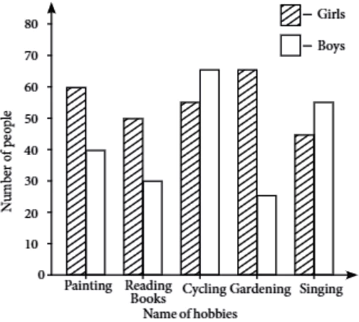
The double bar graph shows the average consumption of food in the two countries; China and India in 2017.Analytical-Eng-10-24 Write an analytical paragraph in 100-120 words summarising the information and make comparisons wherever relevant.

The double bar graph provides information about the consumption of food in the given two countries: China and India. The consumption of food is measured in percentage. The chart illustrates the consumption of four food types in the two countries in 2017.

The largest consumption was of animal products or meat which stood at 50 per cent for China and 23 per cent in India. The second largest consumption was of processed foods at around 34 per cent in China and 39 per cent in India. Vegetable and fruits were at number three levelling around 32 and 27 per cent in China and India respectively. Animal food consumption was significantly higher in China which levelled off at 50 per cent.

The consumption of nuts and seeds has a difference of around 8 per cent between the two countries, China has 19 per cent consumption whereas India has the lowest consumption 11 per cent in comparison to its all other food consumptions.

Overall the chart shows that consumption of processed food is much higher in India than in China. Consumption of fruits and vegetables is 5 per cent less in India. Animal food is used in a significant amount in China. The other two food items have a difference of 5 per cent except in the use of nuts and seeds which was significantly higher in China .e. 8 per cent higher than India.

To conclude we can say that it shows the different food preferences of people of two different countries.

Analytical Paragraph 25

The given bar chart shows the number of girls and boys studying mechanical engineering at Indian Universities. Analytical-Eng-10-25Write an analytical paragraph in 100-120 words describing the given information.

The bar graph illustrates the number of boys and girls studying mechanical engineering at Indian Universities between the years 1998 and 2018 at 10 years intervals each.

It can be seen that the number of male students fell down slightly from 14,000 in 1998 to 12,000 in 2008, and then remained levelled through the following decade. The number of female students is relatively low, starting at 2,000 in 1998. However, while the number of male students decreased the number of female students increased in the coming decades. Female students grew steadily by 2,000 each decade. This led to a rise in the total number of mechanical engineering students from€ 16,000 to 18,000 in this period.

Male students continue to make up the majority of students. However, the proportion of female students increased sharply over the time. In 1998 there was one woman to every seven men, but by 2018 this had narrowed to one woman to every two men.

Overall, we can see a clear upward trend in the number of female engineering students in Indian Universities, while the number of male students seems to have levelled off.

Analytical Paragraph 26

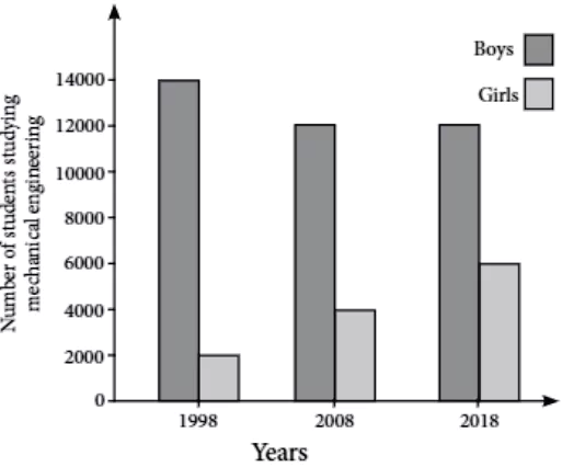
The number of students opting for humanities is higher than commerce and science in last two years. Analytical-Eng-10-26Write an analytical paragraph in 100-120 words based on the statistics of the given chart.

The given graph shows the increasing interest of students in taking up humanities as main subject choice.

The given graph shows the data of two years, if we look at it in 2017 approximately 200 students opted for science, around 150 opted for commerce and around 200 opted for humanities. The interest in science and humanities was almost similar in 2017.

If we look at the data of year 2018, we see that there is a fall in the interest of students in science in comparison to 2017. In 2018 around 175 students opted for science, around 100 students opted for commerce and maximum number of students showed interest in humanities taking the count to a remarkable 225 students in humanities.

To conclude the given information, the interest of students in humanities has seen a subsequent rise in the year 2018 and commerce has seen a slump in the interest rate.

Analytical Paragraph 27

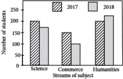
The given pie chart illustrates how internet users aged 15+ prefer to access the internet at home and in other places. Analytical-Eng-10-27Write an analytical paragraph in 100-120 words using the information given in the pie-chart.

The given pie chart illustrates how internet users aged 15+ prefer to access the internet at home or in other places.

The data shows that people aged 15 and over spend most of their time using electronic gadgets and going online accessing internet for different purposes.

From the pie chart it is clear that the majority of people prefer to use smartphone that covers 30 per cent, which means that one third of the total young generation uses smartphones to go online. Laptops are also very popular as there is only three percent of difference between the two. As shown in the chart 27 per cent people prefer to use laptops to go online. 22 per cent prefer to use a tablet, whereas a desktop computer accounts for 18 per cent of users’ preferred devices, and only a small minority of just 3% prefer a device other than these four main popular devices.

To conclude, it is clearly evident that the devices like laptops and tablets are the most popular choices, it shows that the majority of people access internet on portable devices. The desktop computer which is not so convenient to use is the least popular of the four main devices. It can be said that in the future we can expect to see even more and more people accessing the internet with smartphones as their preferred choice.

Analytical Paragraph 28

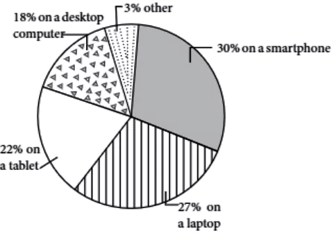
The bar graph shows the amount of money spent on two types of electronic items in India. Analytical-Eng-10-28Write an analytical paragraph in 100-120 words summarising the information and make comparisons wherever relevant.

The double bar graph provides information about how much money was spent on laptops and smartphones in India over a period of five years i.e., between the years 2015 and 2019.

As shown in the graph, it illustrates that there was a significant upward trend in spending on both items. It shows that sales of smartphones has increased steadily by five lakhs each year whereas sales of laptops remained level at fifteen lakh until 2017 and then it made a hike and increased dramatically reaching fifty lakhs in the year 2019.

Although the sale of laptops is still less than the smartphones sales, but they are only 5 lakh behind which shows a good progress in the sales of laptops in 2019.

It signifies that people’s total expenditure on these two electronic gadgets rose dramatically in this period. The total expense of both the devices was 45 lakhs in 2015 which rose to ninety-five lakhs in 2019.

Overall, the sales of both these devices grew, but laptops sales grew more quickly. If these trends continue and fascination of electronic gadgets kept on increasing among people, we can expect laptops sales to overtake smartphones sales in 2020 or soon after that.

Analytical Paragraph 29

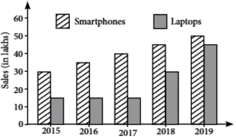
The given bar graph shows the sale of different flavours of ice cream made in an ice cream shop in the month of June. Analytical-Eng-10-29Write an analytical paragraph based on the graph in 100-120 words.

The given bar graph shows the sale of different flavours of ice cream from an ice cream dealer in the month of June. The flavours are vanilla, chocolate, mint choco, butter scotch and mango.

From the graph the first thing we can tell is that for this month chocolate made the biggest sale with almost 1050 cups of ice cream sold. After chocolate the second favoured flavour is vanilla which made a sale just over 800 units. Vanilla’s sale is closely followed by mango ice cream with a monthly sale hitting 800 exact units. Butter scotch has also pulled in decent number with a sale of just under 700 units. The flavour that made the least money in the month of June for this ice cream dealer is mint choco.

Looking at the graph though chocolate is the clear winner, the rest of the flavours are selling well and are almost neck to neck in competition except for mint choco with its sale numbers barely 400 cups. To conclude the graph gives us a better idea about which flavours of ice cream are more in demand and which ones are not.Chocolate being the clear winner and mint choco barely in the race makes an interesting study of choices of people.

Analytical Paragraph 30

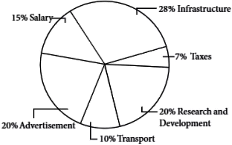
The given pie chart shows the percentage distribution of total expenditure of a company under various expense heads during the year 2019, write an analytical paragraph in 100-120 words using the information given in the chart.
Total expenditure: ₹2,50,00,000Analytical-Eng-10-30

The given pie chart illustrates the percentage distribution of total expenditure of a company under various expense heads during 2019.

The chart shows that the total expenditure of the company was ₹2,50,00,000. From its total expenses the company had spent 28 percent on its infrastructure which covers the major part of the total expenses. Its expenses on the areas of Research and Development, and advertisement were equal ie., 20 percent respectively. The company had spent 15 percent on salary distribution, 10 percent on transport and the least it had spent was on taxes. If we take out the sum total of the total expenditure i.e., ₹2,50,00,000 of the company in the year 2019, we will find out that it had spent 70,00,000 on infrastructure, 50,00,000 on advertisement and it spent equal on Research and Development also. 37,50,000 on salary distribution, 25,00,000 on transport and the least i.e., only 17,50,000 it had spent on taxes.

Overall, the data demonstrates that the most the company had spent was on infrastructure which shows that the maintenance of the company was of very high and top priority. It spends a good amount on advertisement also but it did not provide a good package to its employees, had no proper facility of transport and as the salary percentage is only 15% of the total expenses so the tax expense was also very less in comparison to other expenses.

Analytical Paragraph 31

The given bar graph shows the increasing use of skin care products by men and women over the period of three months. Analytical-Eng-10-31Write an analytical paragraph in 100-120 words elaborating the given information.

The given bar graph shows the usage of skin care products by men and women over the time of three months. The products used are facewash, toner and sunscreen.

The bar graph of men shows that the most used product by men is facewash. In the month of June the facewash was used around 33 times, in July 30 times and in August 35 times. The toner was used around 27 times in the month of June, 20 times in July and around 33 times in the month of August. The sunscreen was used 29 times in the month of June, 25 times in July and 32 times in August.

The bar graph of women shows that the most used product is sunscreen. In the month of June the facewash was used 25 times, in July 22 times and in August 24 times The toner was used 22 times in the month of June, in July 25 times and in August 27 times. The Sunscreen being the most used product was used 34 times in June, 29 times in July and 35 times in August. To conclude the given information, the usage of facewash by man saw a rise in the month of August and reached its peak and usage of sunscreen by women saw its rise in the Month of August too, reaching its peak of 35 times of usage.

Analytical Paragraph 32

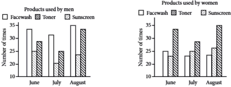
The line graph below shows the average monthly temperatures in two countries.Analytical-Eng-10-32 Write an analytical paragraph on the basis of the graph, reporting the main features and making comparisons where relevant, in about 100-120 words.

The linear graph illustrates the average monthly temperatures of two countries-South Africa and Canada, and the data compares how the temperature in these countries changes throughout the year. The temperature is measured in Celsius.

As the graph illustrates, the temperature in South Africa is roughly 30 degree centigrade in the months of January, February and March and it is 32°C in December, which is the hottest month of the year there. At the same time, the temperature in Canada is subsequently increasing from February to July reaching its highest 28°, but the temperature of Canada in January is 7 degree centigrade, January and December are the coldest month of the year in Canada.

The temperature of South Africa remains 30°C till March and then it keeps falling till July when it is nearly 20°C, which the coolest for the country. Through the rest of year it again starts increasing till it reaches 32°C in December.

To conclude, Canada appears to be cooler country than South Africa, where the temperature is warmer throughout the year.

Analytical Paragraph 33

The given graph shows the decline in the use of television and newspaper with the excessive use of smartphones over the span of three years.Analytical-Eng-10-33 Write an analytical paragraph in 100-120 words describing about the given information.

The given line graph illustrates the decline in the use of television and newspaper with the excessive use of smartphones over the span of three years.

The graph shows that in the year 2014 there were around 180 people who were using television, then there is a huge decline towards 2015 where only 85 people were interested in using it and then there is a continuous downfall in the number people which levelled off to only around 72 people in 2016.

On the other side, there were around 200 people who are likely interested in reading newspaper rather than watching television. It stagnated to 190-150 people for the next few months and started to fall with a drop down of around 80 people in 2015. The number of people interested in reading newspaper shows a striking increase in the next few months which has reached 130 people in 2016.

Overall, the graph shows that there is a huge decline in the use of television and newspaper but there were still more people who were using newspaper in comparison to the use of television. However, the excessive use of smartphones has declined the usage of television and newspaper. In 2016 television has become less popular among people whereas newspaper is still preferred over television by many of them.

Analytical Paragraph 34

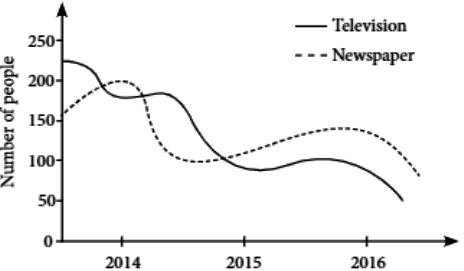
The given pie charts show percentage of girls of class – 9 and 11 regarding their interest in extra curricular activities.Analytical-Eng-10-34 Study the pie chart and write an analytical paragraph in 100-120 words describing the information.

The given two pie charts show percentage of girls of class 9 and 11 regarding their interest in extra curricular activities. The pie charts illustrate that among all the girls of class-9 45% of them are interested in dance, 20% of them have shown their interest in sports, 10% in Karate, 10% in craft and 15% are interested in singing. On the other side, in class-11, 35% girls are interested in sports 25% in Karate, 25% in dance, 10% in singing and 5% girls have shown their interest in crafts. It is evident from the chart that in class 9, maximum number of girls are interested in dance, almost equal number of girls were interested in Karate and crafts which is the least in comparison to all other activities. In contrast with class 9, in class 11 maximum number of girls have shown their interest in sports, almost equal number of girls are there in dance and karate and very few them have shown their interest in craft i.e., only 5%. Overall, the two pie charts show that there is a striking difference of 20% in the number of girls interested in sports in the given two classes. There is an increase of 15% in Karate and sports among the girls of class-11 in comparison to class – 9. Thus, class – 9 has majority of girls who like dancing whereas in class – 11 majority of girls are interested to take part in sports activities.

Analytical Paragraph 35

The given chart shows the number of credit card holders of different banks of four states. Analytical-Eng-10-35Write and analytical paragraph in 100-120 words describing the given information.

The bar graph demonstrates the number of credit card holders of different banks of four states. In the graph, it is observed that in Punjab there are 70 card holders of SIB bank, 90 card holders of CICI bank and 88 people are using card of Sity Bank.

On the other side in comparison to Punjab, Bihar and Gujarat, in U.P. 110 people are using card of SIB bank which is the highest comparative to all the other three given states. Whereas the users of CICI card is almost equal to users of Punjab state. There are 130 users of Sity bank in U.P. In contrast Gujarat has the lowest number of SIB card holders. Then it has 100 and 120 card holders of CICI and Sity bank respectively.

Overall, it is observed that in Punjab and Bihar a significant number of people preferred using card of CICI bank.

Whereas, in U.P. and Gujarat majority is Sity bank cards. Thus, by observing Card holders of all using the given four states it is clear that Sity bank has the highest number of card holders which means that it is most popular among the people of these four states. The second highest is CICI bank. Whereas the least preferred among all the given three banks is SIB bank.

Analytical Paragraph 36

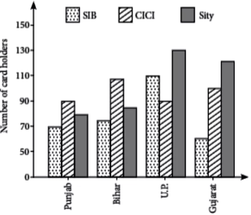
Here’s a graph of different health issues faced by young children between the age of 5-10 in the country. Analytical-Eng-10-36Write an analytical paragraph on the given information in 100-200 words.

The given double line graph illustrates about two major health hazards i.e., malnutrition and obesity faced by children aged between 5 and 10 in our country. The given data covers five years 2015 to 2019.

If we take a look at the given data we can see that obesity stands on a slight downward trend since the beginning but seems to gain pace towards the last year of the data and went higher than malnutrition. In 2015 obesity was reported in about hundred children. It went higher and reached 150 in 2016 and remained almost similar in 2017 as well. The number of reported cases in obesity again went on a higher side drastically and reached about 200 in 2018 and its highest peak was reached in 2019 when almost 300 reports were made of obesity.

Malnutrition on the other hand started on a higher note beginning at more than 150 cases in 2015 itself, it went on to touch more than 200 cases and this data remained stagnant for three consecutive years i.e., 2016, 2017 and 2018. 2019 witnessed a slight dip in the number of reported cases of malnutrition as it hit 200 and remained at it.

To conclude the given information, we can say that both the health hazards are at staggering figures and depict the sorry state of healthcare. Children at such tender age of 5-10 suffer from such health issues. However, the current downward trend in malnutrition can be seen as positive.

Analytical Paragraph 37

Given below is a graph comparing the consumption of healthcare supplements amongst men and women between the age of 25-35 from the year 2016-2020 in terms of their sales. Analytical-Eng-10-37Write an analytical paragraph in 100-120 words based on the details from the graph.

The given double bar graph compares the sales of healthcare supplements consumed by men and women aged between 25-35 in a span of five years. Information given about the sale is in lakhs. One quick glance at the graph can make it evident that men consumed more healthcare supplements than women. Beginning with the year 2016, the sale made by men reached little less than 2 lakhs annually, whereas women consumers touched nearly 1 lakh.

The year 2017 saw a hike in male consumption as they reached 3 lakhs. Women consumers, however, doubled the consumption and reached sale of 2 lakhs. The data of 2018 and 2020 show same consumption figures for men as they went a little higher and reached 4 lakhs and remained there for these two years. Women consumers reached slightly more than 3 lakhs in year 2018 and approximate 3 lakh 80 thousand in the year 2020.

According to the given data the year 2019 was the most lucarative in terms of sales of healthcare supplements by both the genders. The men touched their highest of sales of ₹ 5 lakhs and females reached their highest of sales of 4 lakh 80 thousand in the year 2019.

To conclude the given information we can say that the consumption of healthcare supplements saw an upward strend by both the genders. The year 2019 saw the best of sales and 2016 was not that good.

Analytical Paragraph 38

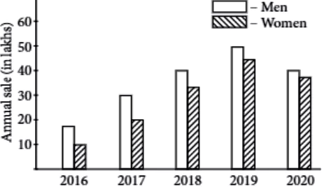
The given graph shows the competition between big online shopping sites that is Amazon and Flipkart in India over the duration between 2016-2019. Analytical-38Write an analytical paragraph in 100-120 words from the details found in the graph.

The given double bar graph throws light on the statistical data of competition between two major online shopping sites Amazon and Flipkart in terms of verified users gained over the period of four years.

The first year of the given data i.e., 2016 was the year when it was beginning to gain pace Amazon had around 2000 verified users whereas Flipkart had a little less than 3000. In the next year, 2017 Amazon saw a slight hike and reached equal to what Flipkart had in 2016. The year 2017 was a great year for Flipkart as it reached 5000 verified users which was double of its 2016 data. As the year progressed and reached 2018 the data for both the sites was almost similar which means Amazon made a significant jump and reached 6000 verified users closely followed by Flipkart which made a continuous hike in numbers in the third year of data as well. 2019 was the best year in terms of garnering the verified users as both the sites saw their highest digits. Amazon, in year 2019 surpassed Flipkart and gained 8000 verified users, whereas Flipkart remained at 7000 verified users.

To conclude the given information we can say that as the years passed the number of verified users increased for both the sites and by the end of 2019 Amazon gained more users than Flipkart and ended on a better note than its starting point.

Analytical Paragraph 39

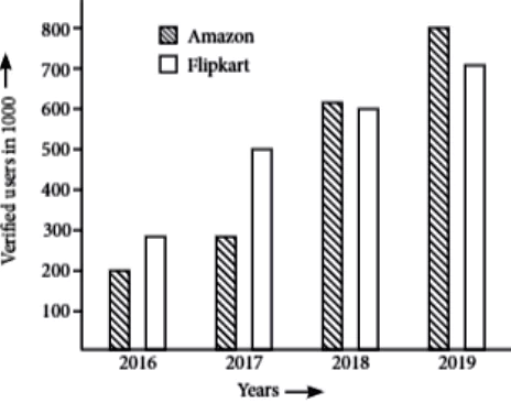
The given bar graph shows the wickets taken by a bowler during five test matches in two years. Analytical-Eng-10-39Study the graph carefully and write an analytical paragraph in about 100-120 words.

The given double bar graph depicts the number of wickets taken by a bowler during five test matches in two years i.e., 2019 and 2020.

The first glance at the graph makes it evident that the performance of the bowler was better in 2019. In 2019, the bowler took only one wicket in 1st test match. However, in other four matches his performance excelled. In second test match, the bowler took 4 wickets. In third test match he took 3 wickets and in fifth he took 5 wickets. His fourth match was his best performance in which he took six wickets in total. In the whole year he took a total of 19 wickets.

In terms of performance 2020 was not a good year for the bowler, as per match and overall performance saw a downward trend. The bowler began on a better note taking 2 wickets in first match of 2020. However, in 2nd and 3rd test match, the performance came down and the bowler only took 1 wicket in each match. Fourth match proved to be a reviving stroke after 3 consecutive poor performances and he took 4 wickets in fourth match. In the next match, the bowler continued his upward performance streak and took five wickets.

To conclude the given information, it can be said that throughout both the years, the bowler’s performance was quite fluctuating. However, by the time of last/ fifth match the bowler seemed to catch pace in both the years.

Analytical Paragraph 40

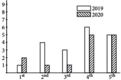
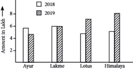
The given bar graphs show the sale of 4 sunscreen brands in the time span of two years in Delhi during summer in rupees. Analytical-Eng-10-40Write an analytical paragraph based on the information provided in the graph in 100-120 words.

The given double bar graph showcases the data of the sales of sunscreen in summer months in Delhi in two years i.e., 2018, 2019. The four mentioned cosmetics brands are Ayur, Lakme, Lotus, Himalaya and the amount mentioned is in lakhs.

The year 2018 saw somewhat static sales and it went uptil 6 lakh or less for all four brands. In 2018 Ayur and Lotus made similar sales and garnered around 4 lakh 50 thousand by it. Himalaya comes next by making a total sale of 5 lakh 20 thousand. The most profitable sale was made by Lakme and it gained 6 lakh total rupees from the sales.

In 2019 the sales of sunscreen were comparatively higher and all 4 mentioned brands except Lakme made better sales. Lakme remained static at 6 lakh rupees sales in 2019. Ayur made a slight hike and reached 5 lakh in the year 2019 making a profit of 1 lakh rupees. The sales of Lotus also witnessed a rise and reached 7 lakh and company made a profit of more than 2 lakhs. Himalaya also saw a rise in sales and reached 8 lakh with a profit of 2 lakh in 2019.

To conclude we can say that Himalaya stands out as the most preferred brand with the best sales in both the years. And Ayur appears to be the least preferred brand whereas the sales of Lakme remained static.

You cannot copy content of this page